Data sonification: Algorithmically generating soundscapes from 3D datasets
Introduction
The Chandra X-ray Observatory [1] introduced me to data sonification: the translation of data into sound. Their team of astronomers produced ethereal soundscapes from astronomical data that engage one’s sense of hearing, complementing the more familiar visual representations of our galaxy.[1] This auditory perspective makes complex data accessible to the blind and low-vision community,[2] and more broadly evokes the feelings of wonder music so naturally brings.
Inspired by the work from the Chandra Observatory, I developed an analogous data sonification tool that produces a musical composition from a 3-dimensional dataset. Here, I use an illustrative example to show how the tool converts a 3D dataset into a waveform, and converts it into a musical composition. The implementation of this sonification method is freely available as a Jupyter Notebook on GitHub [3] to encourage easy collaboration and customization. I envision that this tool can be broadly used to teach complex chemical engineering principles and to share research findings in the chemical engineering community.
How the sonification works
In order to generate a soundscape from a given 3D dataset, the data must be converted into a time-dependent signal resembling a waveform. The waveform should have oscillations at frequencies—which specify the pitch—that lie within the human auditory range. The signal should also have a large enough amplitude so that the pitch produced is audible. Three things must therefore be extracted from the data:
- A frequency of oscillation at a given point in time.
- An amplitude for that oscillation.
- A change in that amplitude and frequency over time.
These three essential features (frequency, amplitude, and time-dependence) suggest that we can construct our soundscape by converting each dimension of our 3D dataset into one of these features.
The approach to extract these features is best explained by using an example dataset. The data is generated from the following example function that expresses variable Z in terms of variables X and Y:

Figure 1 shows the values of Z with respect to X and Y represented as a surface plot viewed at an angle (a) and from the top-down (b):
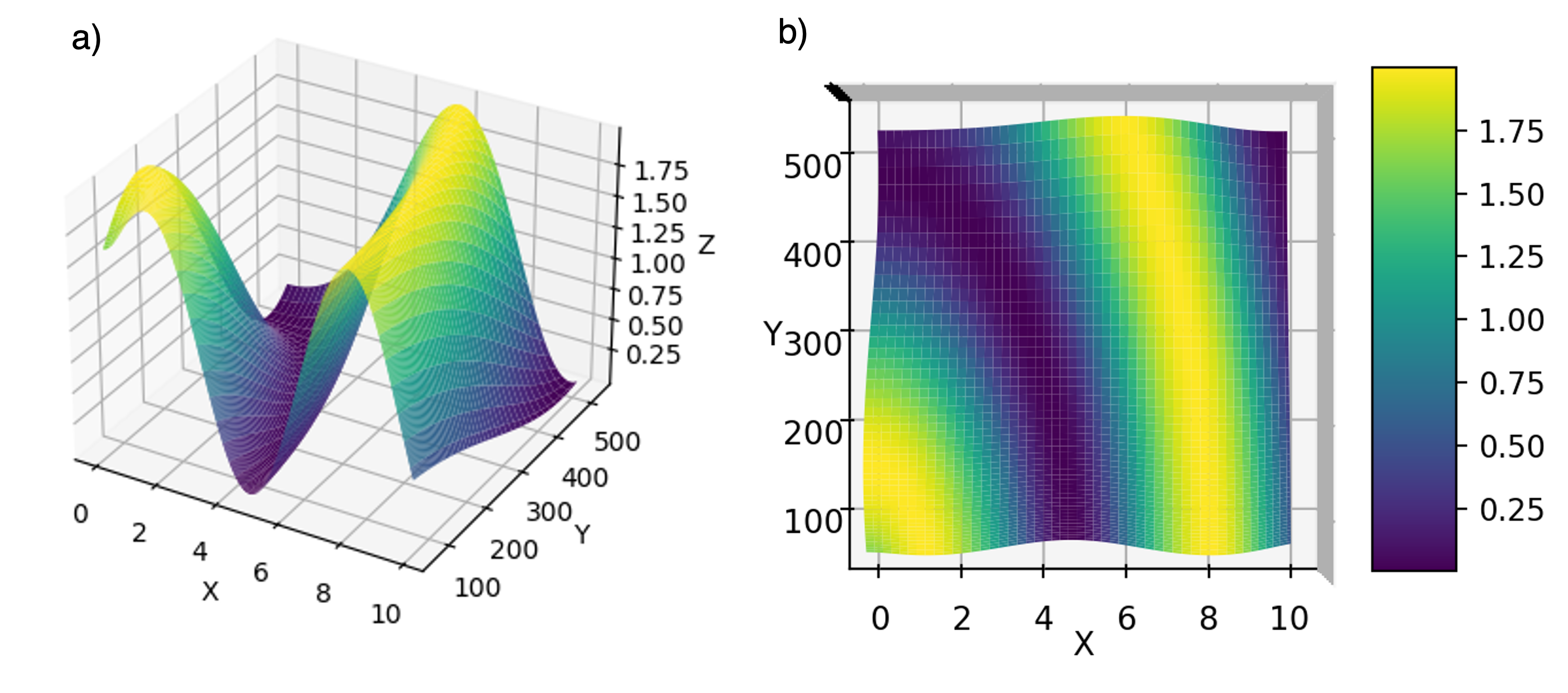
Figure 1: Surface plot showing values of Z as a function of X and Y variables from a diagonal view (a) and top-down view (b).
To use this function to generate a musical composition, we first re-assign the X, Y, and Z-coordinates as time, frequency, and amplitude, respectively. Next, imagine that this surface plot represents a symphony played by an orchestra with each musician playing a single note with a specified frequency. Those specific frequencies reflect single points along the Y-axis. We can then determine the amplitude (Z-value) a single musician plays at a given point in time (X-value) by taking a slice along the XZ-plane at fixed Y-value. Figure 2 shows one such slice for a musician playing at 300 kHz.
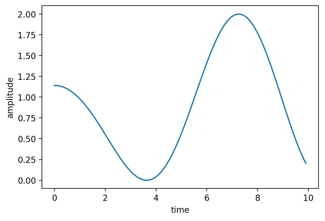
Figure 2: The amplitude as a function of time for a slice in the XZ plane at Y=300 in Figure 1.
Now we know the amplitude a musician plays with time, but we also need to incorporate the frequency of the note they play into our curve to generate a waveform that represents their sound. We can generate this waveform by first assuming the note produces a sine wave. Then, we can use the mathematical definition of a sine wave to express the signal (w) with respect to time (t), the time-dependent amplitude (a(t)), and the frequency (f) through the following expression:

Figure 3 shows the waveform generated by this equation for w at different times. Note that the curve in Figure 3b resembles that in Figure 2, but with the trend appearing reflected about the x-axis, and with the region in-between shaded in. This reflects the high frequency of the wave (300 Hz) which rapidly oscillates the wave signal to +/- the amplitude.
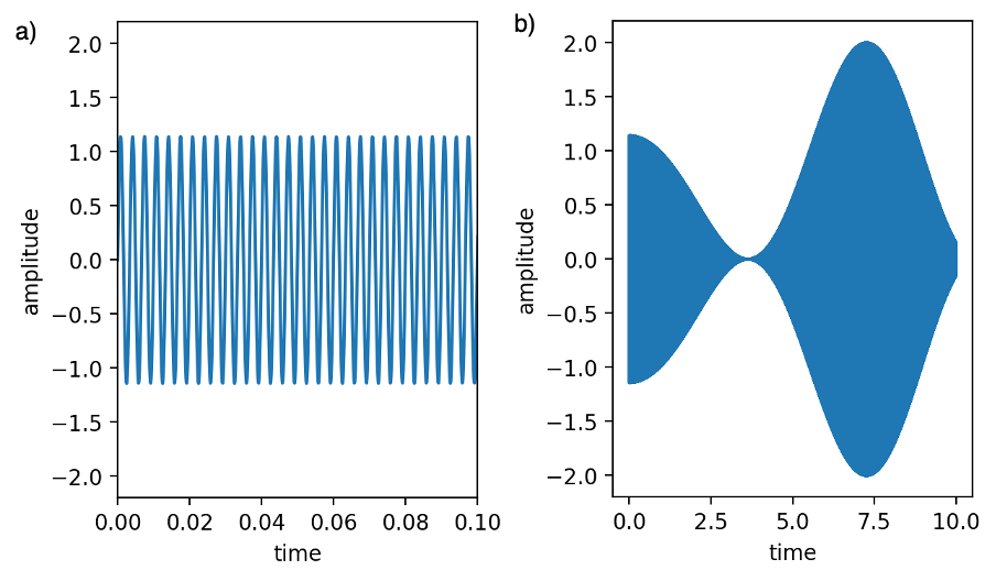
Figure 3: The wave signal (w) produced as a function of time from the amplitudes in Figure 2 with a frequency of oscillation of 300 Hz. (a) and (b) show the signal with different ranges on the x-axis.
Now that we have a method to generate a waveform spanning the duration of the composition for a given frequency, we can compose a symphony from an orchestra of single-pitch musicians by adding together the waveforms each of them produces. Mathematically, the combined wave played by N musicians can be expressed by the following sum over each individual waveform:

Figure 4 shows the combined waveform (W(t)) for a combination of 100 frequencies played (N=100), with the amplitudes scaled for exporting as a WAV file.
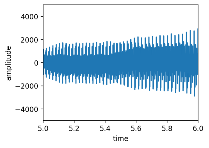
Figure 4: The combined waveform (W) as a function of time produced from the surface plot in Figure 1.
You can listen to the soundscape generated for this data on GitHub [3] (titled “data_sounds_29_Dec.wav”) or on Soundcloud [4]. You can also review the code to generate this soundscape from the Jupyter notebook titled “surface_melody_blog.ipynb” on GitHub.
References
- The Chandra Observatory’s webpage on sonification: https://chandra.si.edu/sound/ (accessed 28 December 2024). Example soundscapes produced by the Chandra Observatory posted to YouTube: https://www.youtube.com/watch?v=bGIrW_hbgiI (accessed 28 December 2024).
- https://www.nasa.gov/general/listen-to-the-universe-new-nasa-sonifications-and-documentary/ (accessed 28 December 2024).
- https://github.com/ari-fischer/education_and_outreach/tree/main/soundscape_3D_data
- https://soundcloud.com/ari-fischer-930550194/data_sounds_29_dec